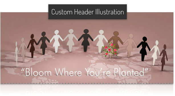
I design for print, packaging, web, apparel. I create custom websites for any purpose.
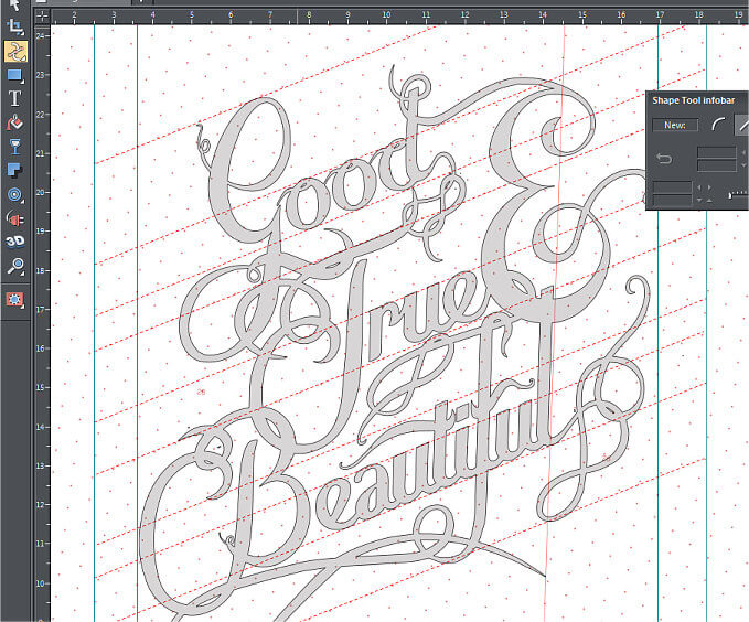
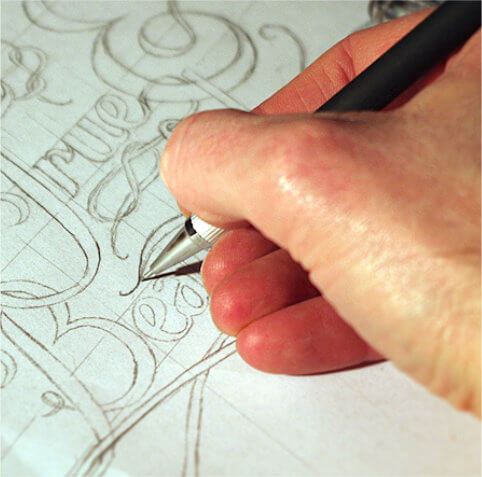
Hand-Lettered Poster Project Presenting My Philosophy of Design and Life.
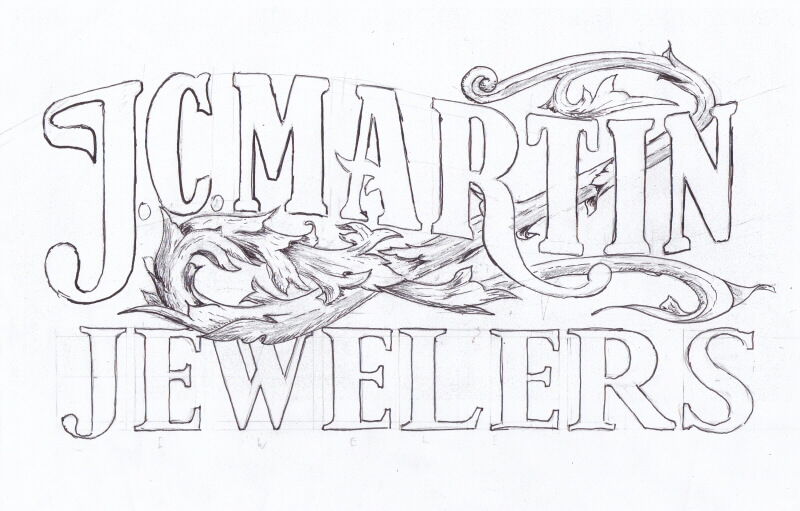
Window Lettering Project in the vain of classic gold guiled storefront windows.
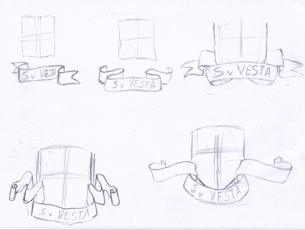
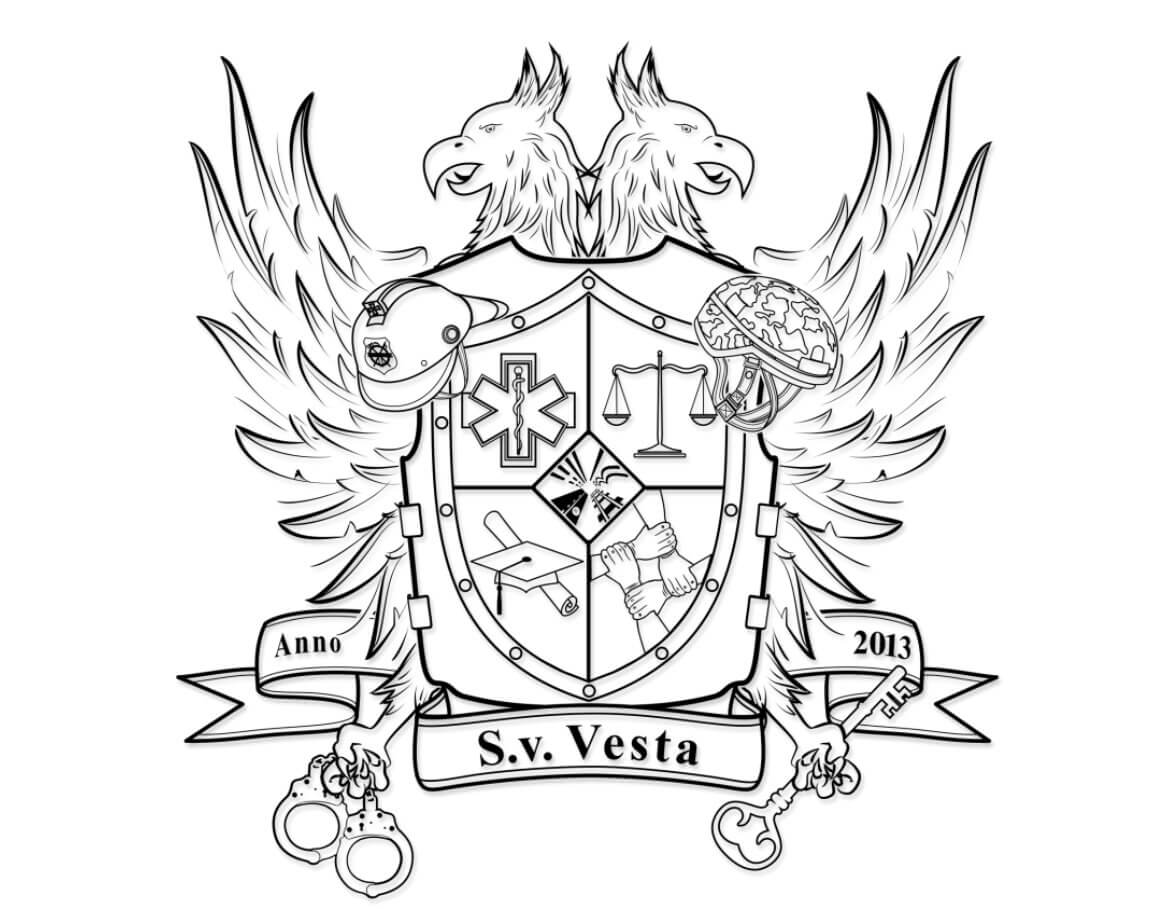
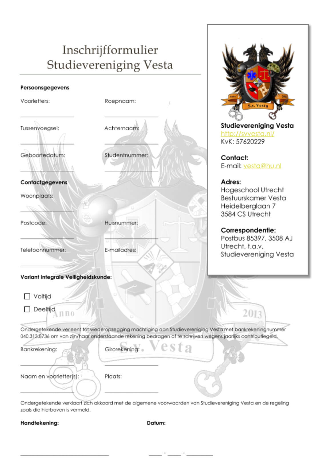
Heraldry Project for Student Association at University of Applied Sciences Hogeschool, Utrecht, Netherlands
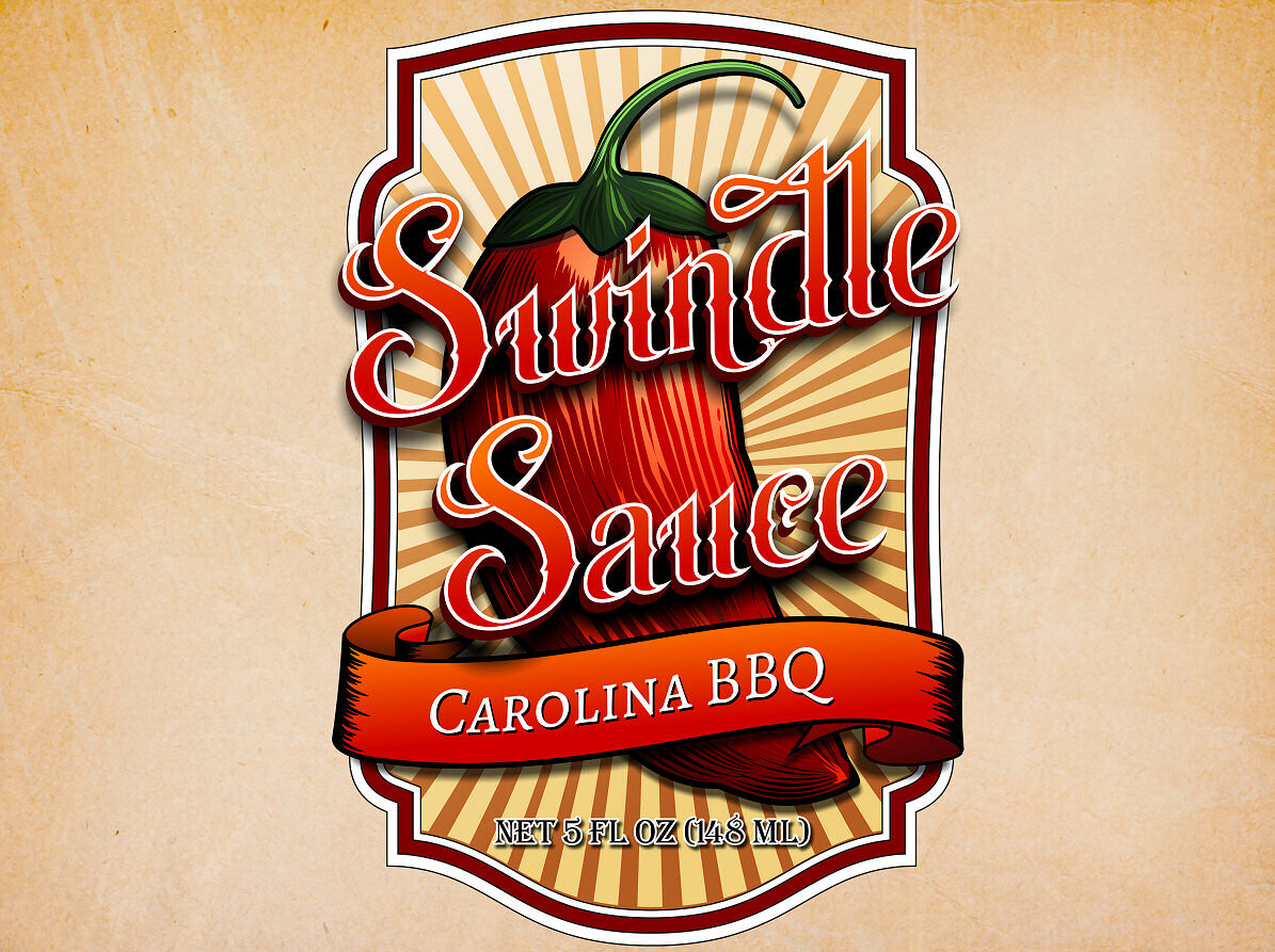
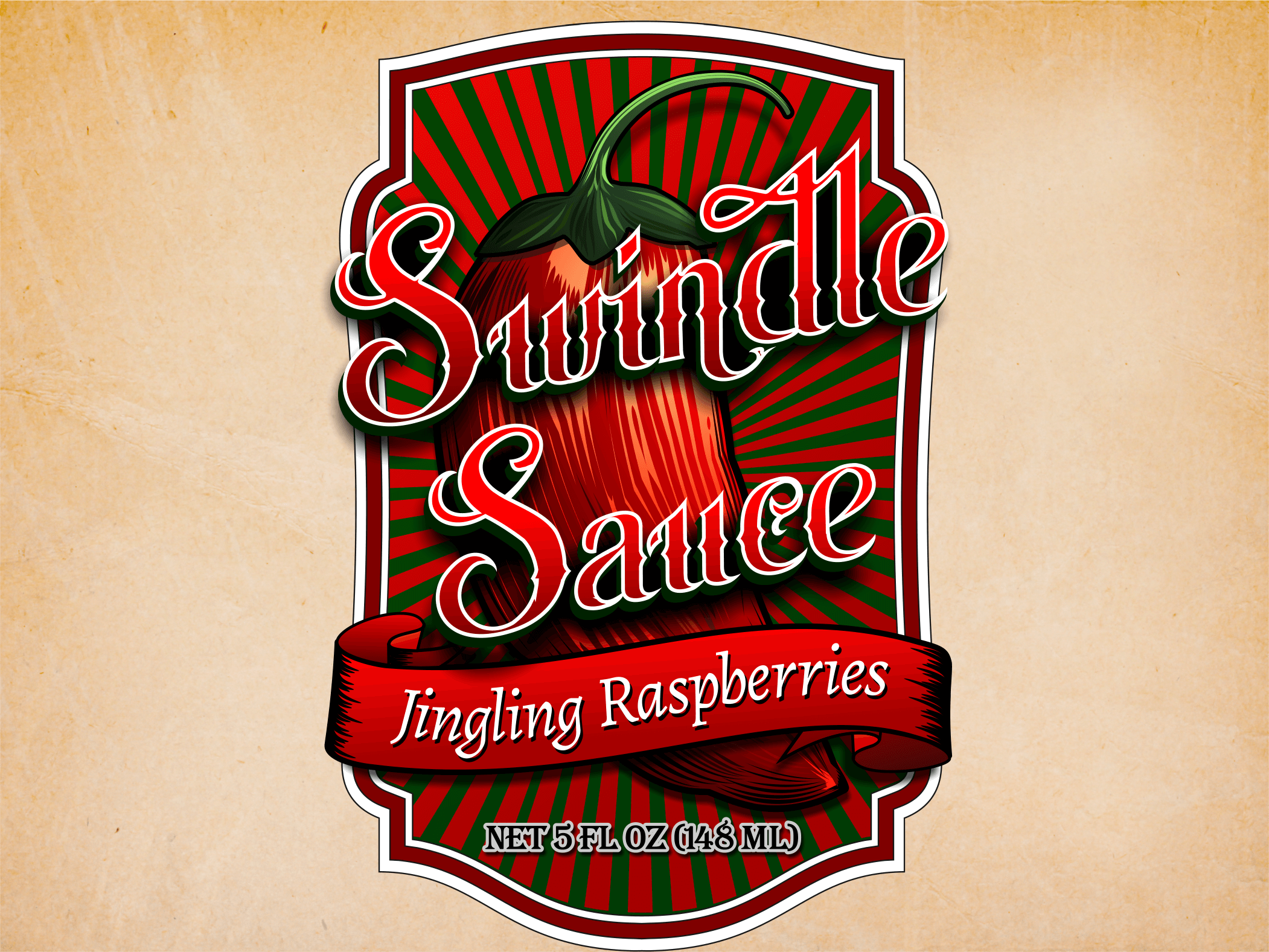
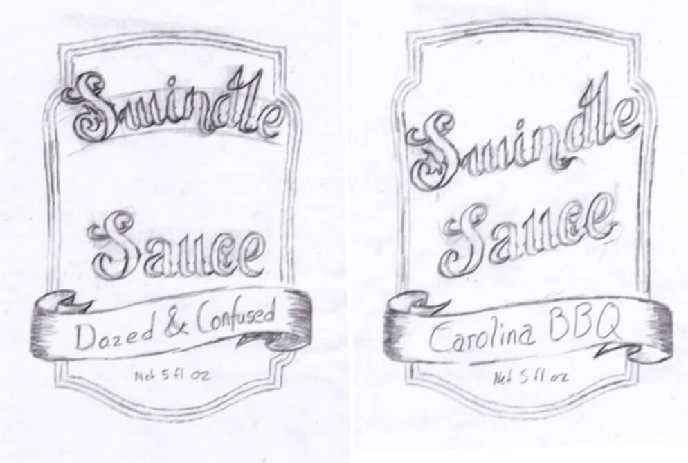
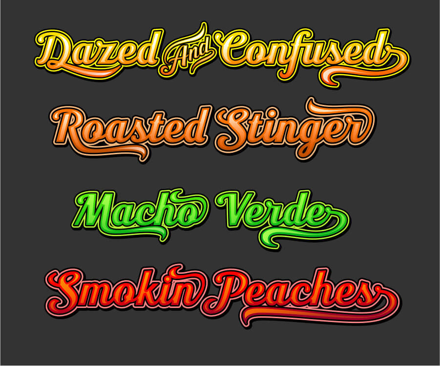
Packaging & Product Labels for small gourmet sauce startup
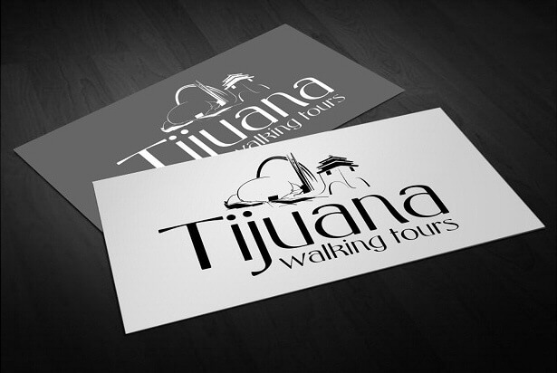
Branding & Visual Identity Project using well known landmarks in Tijuana.
Complete Branding & Website Development Project For Security Focused Blog
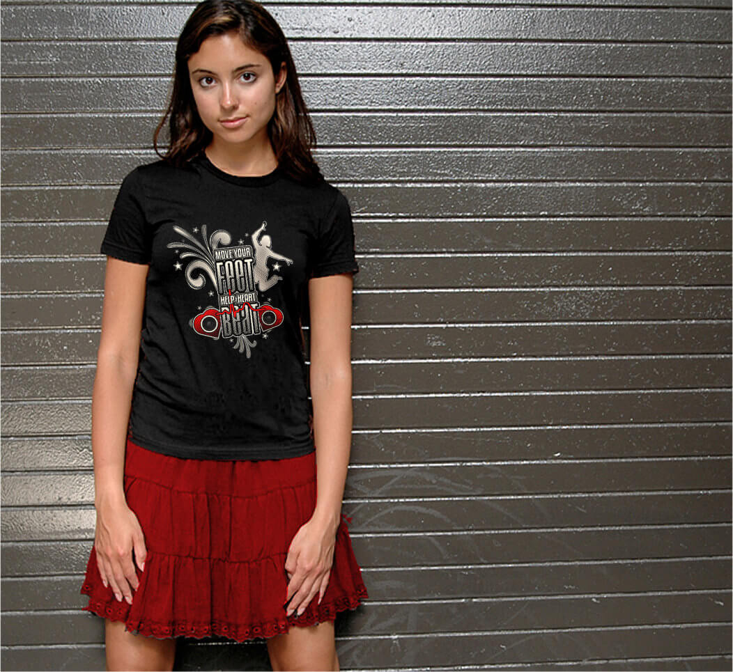
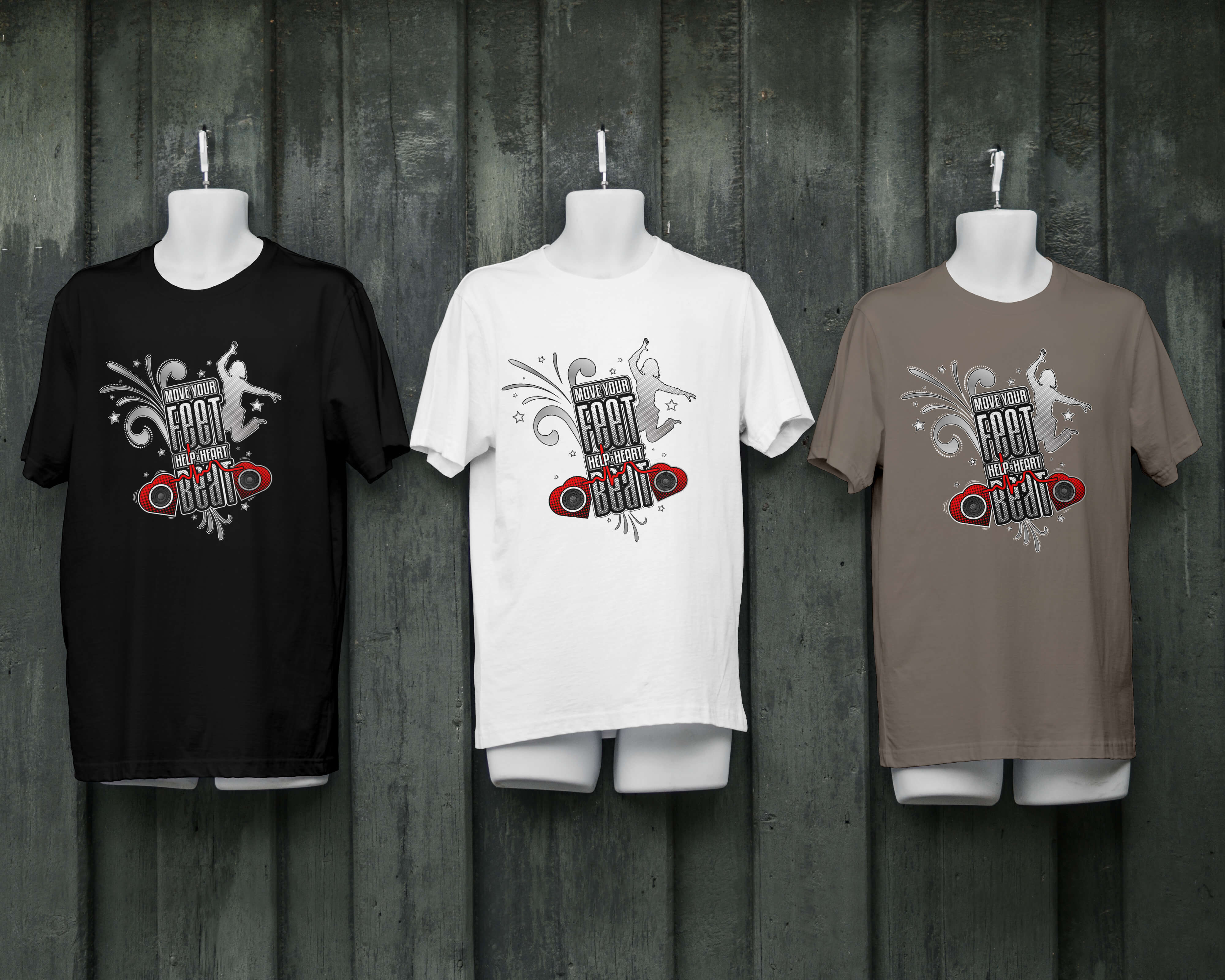
Miracle Network Dance Marathon T-Shirt Design for Houston Children's Hospital Fundraiser
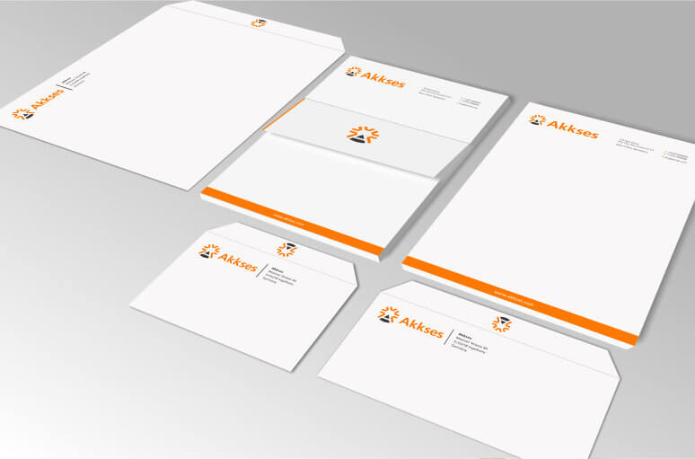
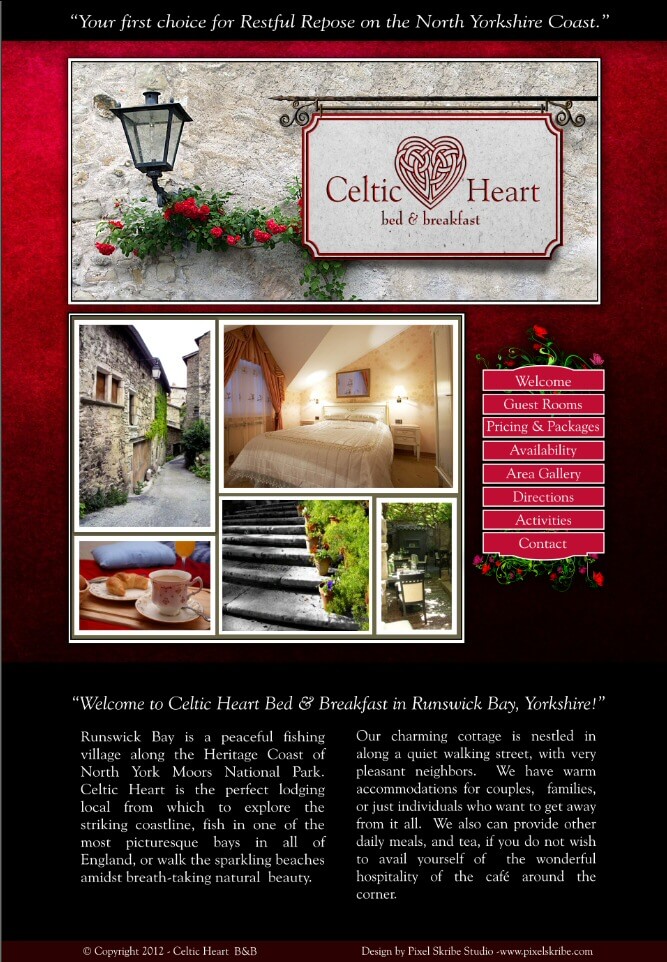
Sampling of various business projects for print, branding, and web.
This was a personal project I created printed to give to clients and friends. The quote featured on the poster has always been one of my favorites by the artist, typeface designer, and printmaker Eric Gill.
The project started with a series of hand drawn sketches and then was digitized into into vector using an isometric grid for the final layout. Each shadow was added individually at every junction to give the sense of depth.
This project involved a study into the traditional designs of classic storefront windows done by master gold gilders of days gone by. It was designed to reproduce the traditional look using computer cut vinyl graphics.
Using references of vintage gilded windows, I developed a series of simple hand sketched designs. Then I worked to refine the chosen style and further added the acanthus ornamentation for extra elegance.
Once the sketch work was satisfactory, I digitized the whole design as a multi-layered vector that could be used by the sign company to produce the final vinyl graphics.
This project was for the Student Association of Public Safety and Emergency Services at the University of Applied Science Hogeschool, Utrecht, Netherlands. They requested the development of a Coat of Arms or Heraldry with imagery that would encompass each branch of study.
Initially this required extensive study into traditional heraldry to develop ideas for illustration that would be used in the final graphic. Multiple sketches were made for each element and then eventually combined into a cohesive design.
With the hand drawn design approved, the sketch work was vectorized, with multiple color variations and simplified versions beign created for using in various graphic applications. The graphics were used for signage, printed materials, yearbooks, t-shirts etc.
A project consisting of packaging and label design for a small sauce startup. The owner wanted a blend between traditional labels and a modern look. I sketched several label designs by hand and then we collaborated to arrive at the final design.
I used reference material from vintage product labels to help with developing the overall aesthetic. The lettering style was my own design and then I added the pepper with a subtle "wood-cut" look. Later I adapted the original design for a simpler taco sauce label.
For this project I was commissioned to design a logo for the branding of a organization operating in Tijuana, Mexico. They asked for imagery that would represent familiar landmarks throughout the city of Tijuana. 5 locations were chosen and 4 were incorporated into the final logomark.
For a minimal appearance each landmark was rendered as basic line art with varying stroke weight to give each landmark dimension without depending on shading. The arrangement of the landmarks leads the viewers eyes backward into the illustration as if on a tour.
A simple lock logo was decided on for representing the overall mission of the site, “Helping individuals secure their computers, networks, and data.” For consistency and visual aesthetic the lock logo was designed on a 8x8 grid.
The lock logo was later incorporated into the sight name to create a homogeneous wordmark. The cable was added as as a visual cue to reinforce the computing technology focus of the site. Elsewhere the lock imagery was used in other site elements adding further continuity to the blog theme.
Built on Wordpress, the entire site needed to be mobile and tablet friendly, so attention was placed on making the layout and content responsive based on screen size.
This was a pro bono project for the Children's Miracle Network's yearly "Dance Marathon" and the Houston Children's Hospital. The Dance Marathon is an eight hour event that allows other teens and children to "be on their feet for those who can't" The request was for a t-shirt design that was elegant and energetic, and could be digitally printed or screen printed in 4 colors or less.
The project started as a simple sketch to give an idea of the layout and look and then the design was created using custom digital stippling to add unique gradient shading without use of typical halftones. The final graphic consisted of only 4 spot colors in separate layers. If printed on black shirts only 3 colors were necessary for production.
I have years of experience designing logos for businesses, brochures and flyers for marketing, promotional materials, info graphics, custom vector illustration, 3d modeling and rendering of business related assets, magazine layouts and much more.
I have extensive experience in Website design and development, UX & UI design, Front-End & Backend Software Development, Email Design, and much more in relation to Internet technology.